How to Optimize Your Product Listings
The best way to know what real people like is to get the elements of your product listing (the description, photos, and name) in front of them. Are they seeing what you intend them to see? Do they bring associations you didn’t think of? As you test your listing, common themes and reactions begin to emerge. These insights will give you a sense of how to improve your listings, and ultimately, your sales.
With millions of products in the e-commerce universe, it’s difficult to stand out. However, by thinking strategically about your product listings and using feedback and data to improve them, your products will look most appealing and generate more sales.
The thing to remember when it comes to product listing optimization is that there are two audiences you need to optimize for: the search engines and real people. Too often, sellers over-optimize for the search engines without considering what shoppers will be drawn to.
When a search engine features your listing prominently, more people will look at it. That’s a given. But if lots of people look at and ultimately buy your product, search engines take notice, and that contributes to a marketplace giving your listing top billing. The signals reinforce each other.
These tips will help you optimize your product listings in a way that appeals to both search engines and people.
Perfect Product Descriptions
If you’re a reseller, don’t simply cut and paste the manufacturer’s product descriptions. The duplicate content makes it difficult to rank in the search algorithms. Instead, shape a voice for your brand that emphasizes an important quality about the product or a feeling that the product will instill. For instance, if your products are well-made, your descriptions should highlight the craftsmanship and high-quality materials. A strong brand voice helps instill confidence in your store and its products.
Your descriptions should serve a practical function, too. Seek to answer the most common questions about the product. Examine competitor descriptions and include any details you feel they’ve left out. Try to overcome common objections shoppers may be feeling. Illustrate product features by offering real-world scenarios where a feature will come in handy. And as you’re doing all this, incorporate valuable search keywords throughout the text.
If you’re not a wordsmith, try hiring more than one copywriter to craft your descriptions. Weigh their different approaches against one another to see what resonates. One of the best ways to do this is to survey the various options with customers using PickFu, an instant polling software. PickFu not only creates your survey but also quickly brings respondents to answer your most burning market research questions.
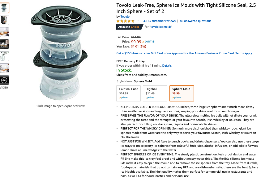
Here’s an example. In one PickFu poll, 50 Amazon Prime members were asked which product description they liked better for a spherical ice tray. The two descriptions were similar in length, but the second option used capital letters to introduce each bullet point, such as “KEEPS DRINKS COLDER FOR LONGER” and “PERFECT FOR THE WHISKEY DRINKER.” Respondents found this all-caps type treatment easier to skim and more attention-grabbing. You can now see the winning description on Amazon, where the product has garnered the highly sought-after “Amazon’s Choice” status.

Take alluring product photos
Your product photography might be the most important element on the page. Remember that online, photos are the closest shoppers can come to feel the product in their own hands. Therefore, your photos must convey not only the physical aspects of your product (color, fabric, size, etc) but also impart some emotional appeal.
Show multiple angles of the product by itself, but take (or create) in-use lifestyle images as well.
Your photos can also become mini-ads by overlaying text and graphics to point out features and attributes. For products with several components, show all the included pieces so shoppers understand what they are buying. If you’re shooting the product photos yourself, check out these DIY tips from a professional photographer.
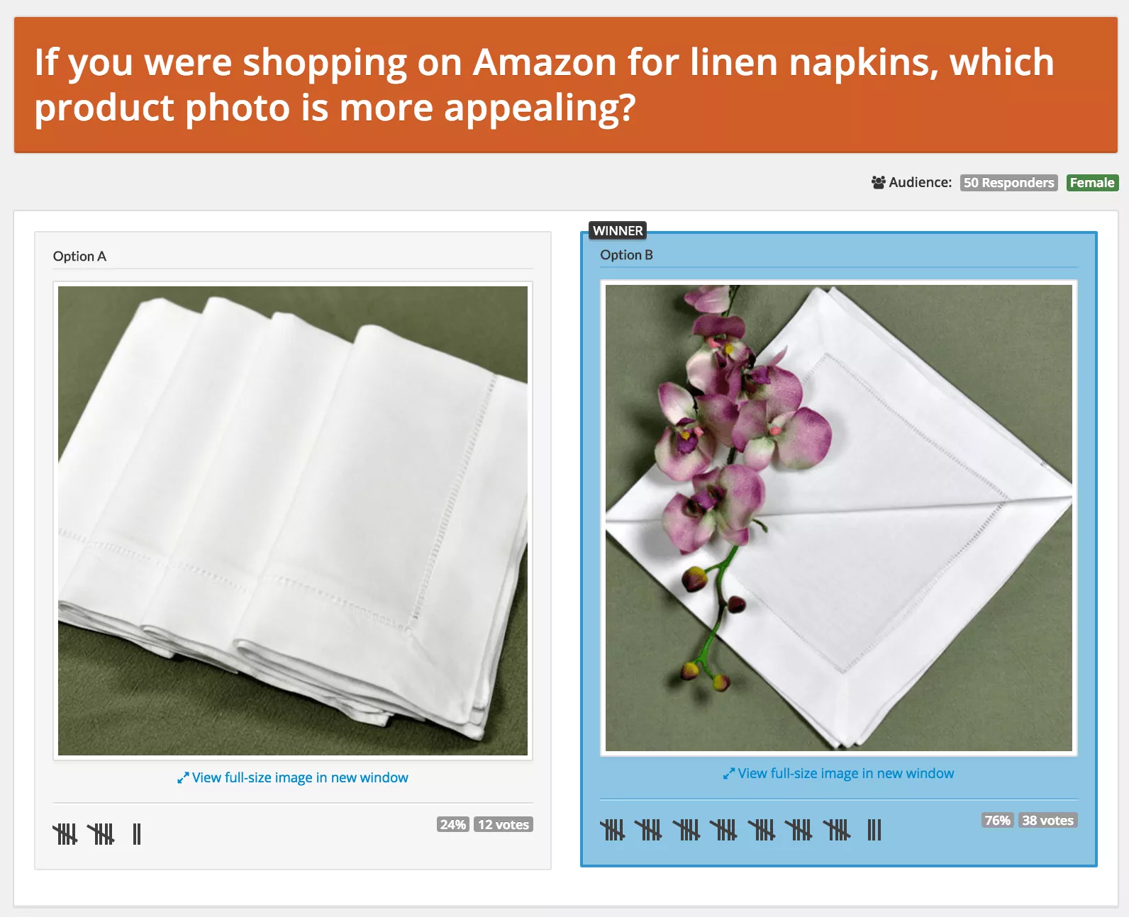
Your product’s main photo may significantly affect its click-through rates. Choosing which image to use should not be left to chance. Gather feedback through testing. Here’s an example:
The online store Bumblebee Linens tested two product photos using PickFu. In less than 20 minutes, 50 female poll respondents showed a preference for a new photo over the old one. When the listing was updated with the new photo, sales of the item jumped 209%.

Create a memorable brand name
Your product’s name is a perfect example of needing to appeal to the two audiences described at the beginning of this article. The algorithms think in keywords and straightforward descriptors of what the product is or does. But people like brand names that are short, distinct, and catchy. The title on your product listing will likely combine both a product name and some valuable keyword descriptors.
The keyword part is easy. But what about a strong brand name?
Product names can evoke the kind of customer the product is for, highlight a unique selling proposition, or say something about the value it offers to buyers. No matter what imagery your product draws upon, your product’s name is its calling card. It’s how customers will talk about your product to other people (if you’re lucky enough to have them do that).
Once you’ve ideated a list of possible product names, it’s important to get outside perspectives. People who aren’t as close to your product as you are can uncover blind spots and unintended associations you may not have thought of. You’ll get a sense of whether you’re headed in the right direction, or whether you should try something else.
Here’s a good example. A seller was developing a product to help apartment renters start an organic vegetable garden in their limited outdoor space. Turning to PickFu, two product names were tested: PatioHarvest and PorchFarmer.
The difference between patio and porch was a decisive factor in why over two-thirds of respondents preferred PatioHarvest. As one poll respondent noted, “apartments have patios most of the time, not porches.” On top of that, the word farmer didn’t resonate with customers at all. One respondent said, “Harvest evokes images of the products you will get from your garden. Farmer evokes images of hard work!”
Conclusion
As you consider product listing optimization, remember it’s not all about the search engines. Search engines don’t buy your product; people do. It’s not enough to create keyword-stuffed, robotic-sounding descriptions and product names. You have to appeal to people’s desires.
Popular Posts
Posts by Topic
- Dropshipping (5)
- Dropshipping Automation (4)
- Dropship Suppliers (3)
- EDI (3)
- Pricing Strategy (3)
- Amazon Seller Central (2)
- Conversion Rate Optimization (2)
- Dropshipping Products (2)
- Order Management (2)
- Vendor Product Catalog (2)
- Dean Soto (1)
- Feature Announcement (1)
- Online Empire Academy (1)
- Product Optimization (1)
- Shipping (1)
- referral marketing (1)